South Side Weekly Dashboard
The opportunity
South Side Weekly (SSW), a nonprofit newspaper dedicated to supporting cultural and civic engagement on the South Side of Chicago is produced by a mostly volunteer editorial staff from across the city.
Currently, much of the information about what volunteers do is tracked informally or not at all, making it hard for volunteers and staff to see, at a glance, what volunteers are doing and to give some definition to their work.
Research
Information gathering
Artifact analysis on SSW’s writer’s guide and Airtable account
Competitor analysis on 2 other volunteer-based organizations
8 Interviews to understand volunteer’s background, involvement with SSW, current practices and pain points
Assumption list based on personal experience and previous interviews
Survey created to verify assumption list (postponed due to COVID-19)
Participatory design to understand volunteer's workflow
Findings
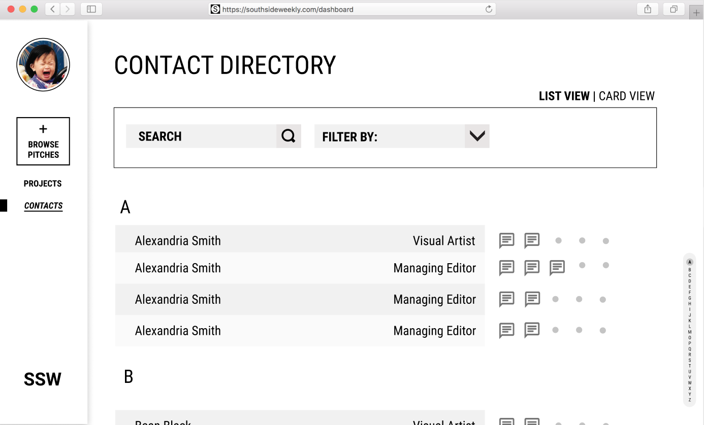
The process of claiming pitches have not been standardized
Multiple communication methods make communication and progress tracking hard
The reporting process is unclear due to the organization’s lack of hierarchy
File sharing between volunteers of different roles is inefficient (writers, illustrators, photographers, fact-checkers, etc.)
People want to join SSW to learn, grow and meet people
Not everyone shares the same onboarding experience which makes the process informal
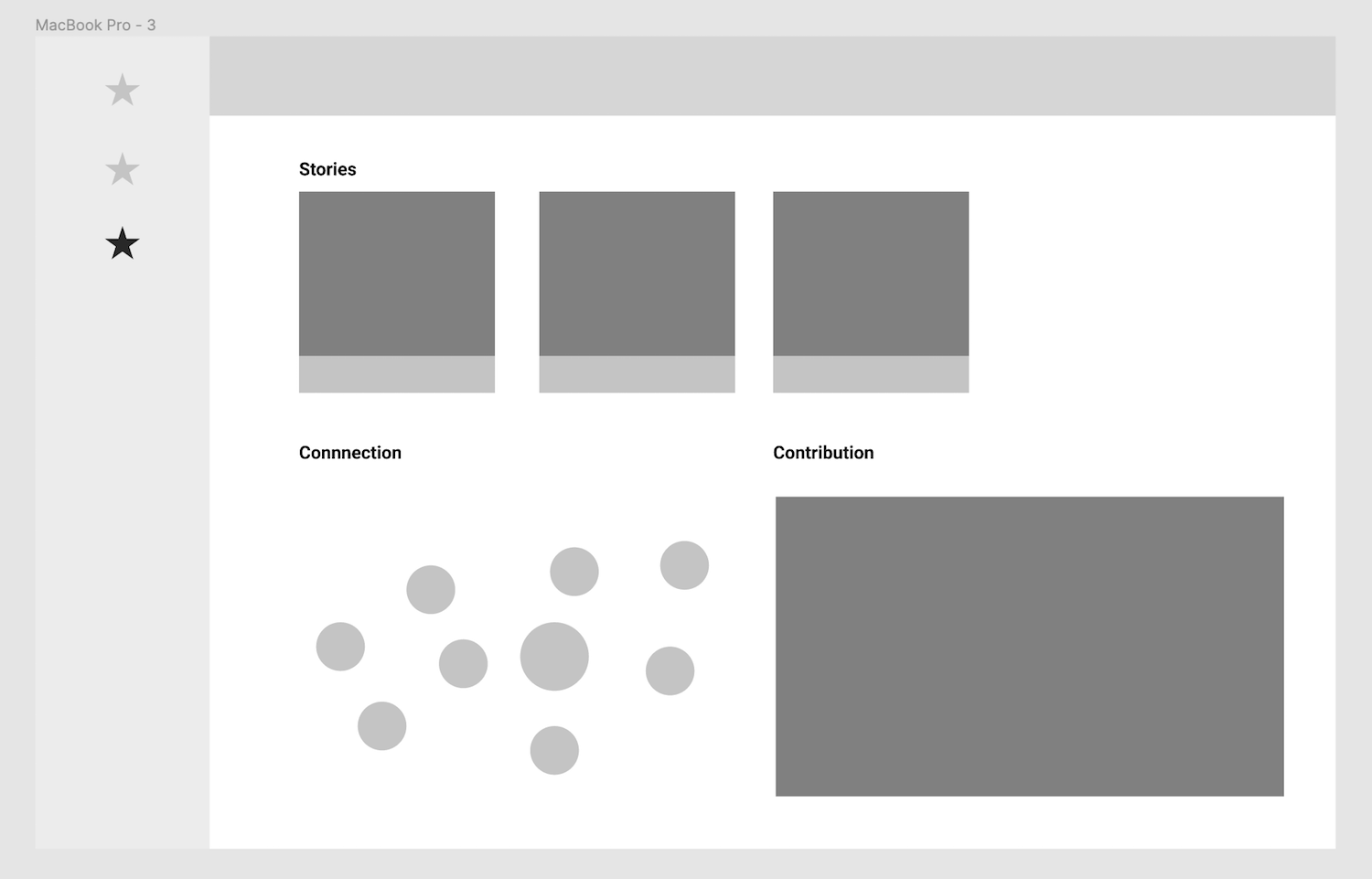
Volunteers find it hard to connect with people due to a lack of face to face interaction
Volunteers learn as they go and have to put in lots of effort to feel engaged
Design process
Priority listing
To figure out which findings to focus on (bolded in findings), we drew an impact effort matrix (image on right). Afterward, we came up with a list of solutions, categorized and prioritized them into the list seen below.
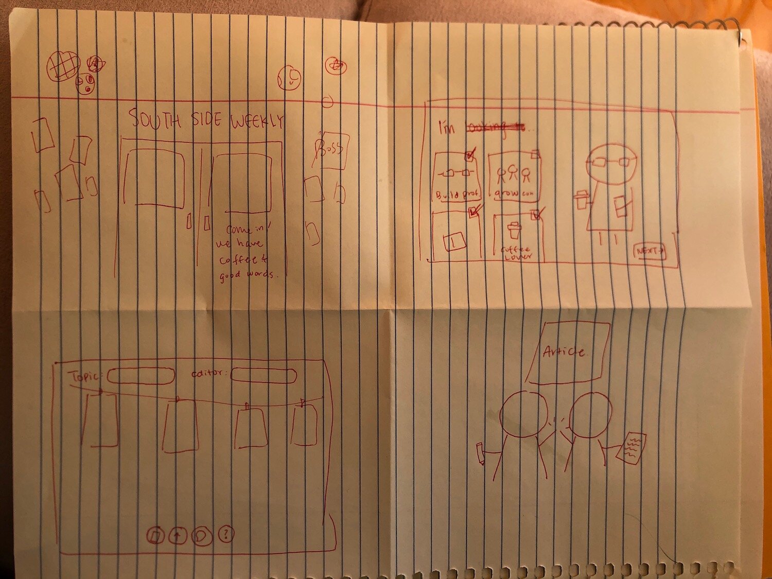
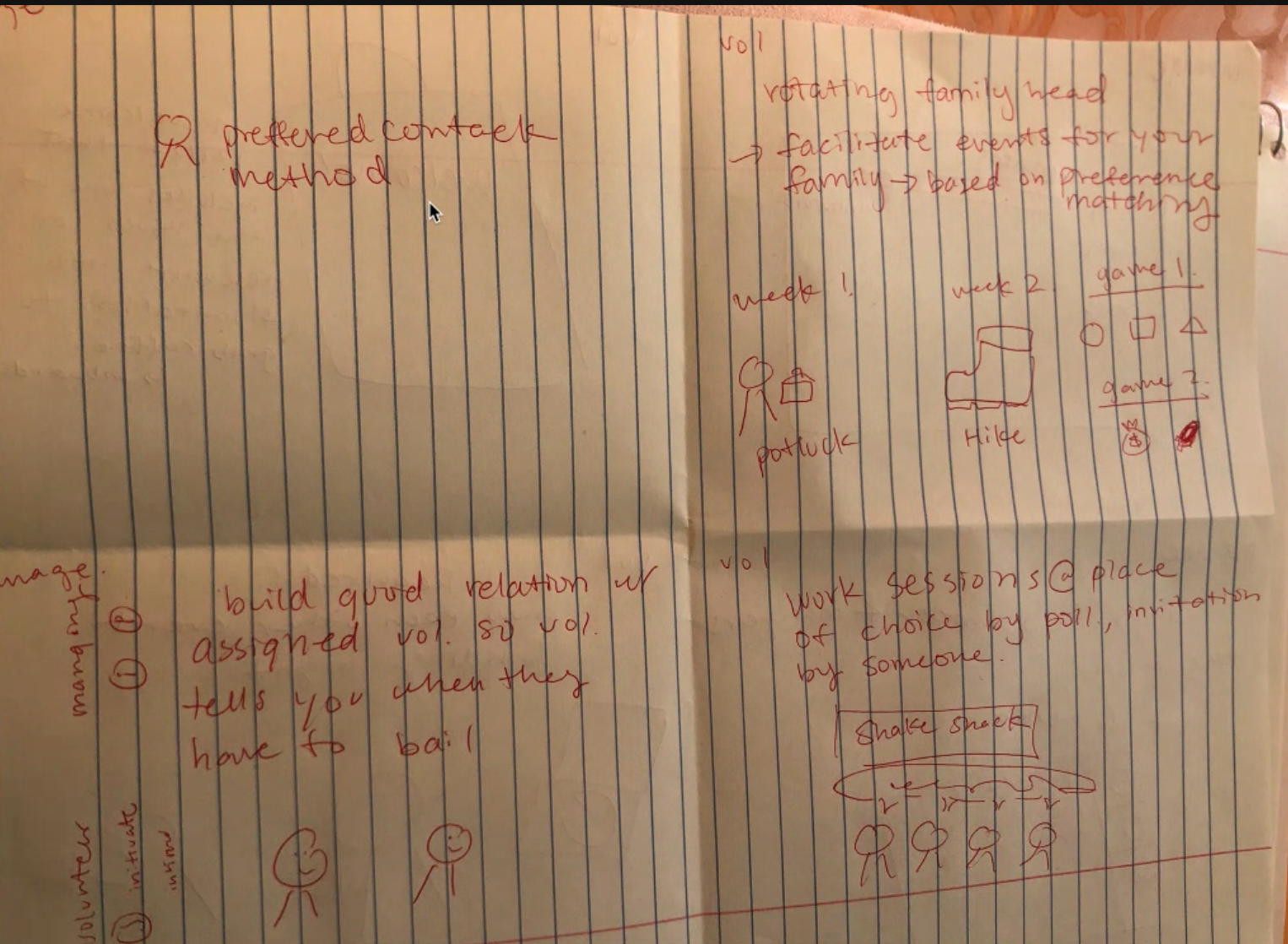
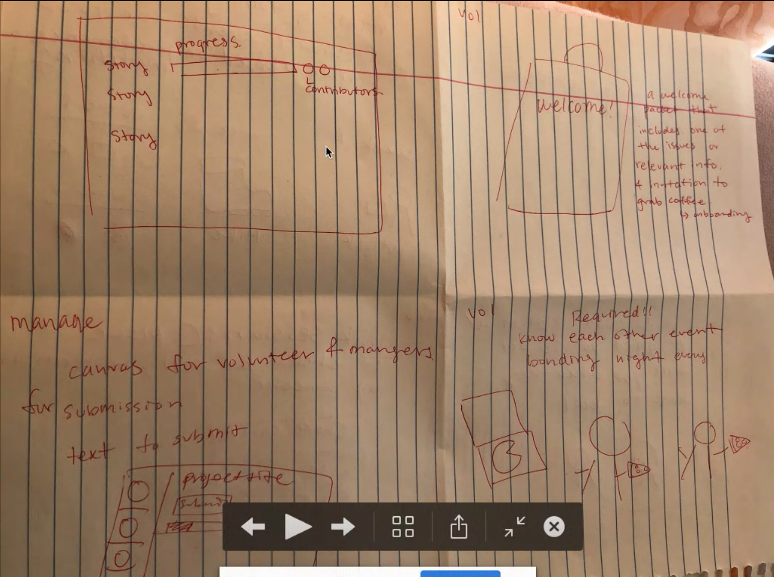
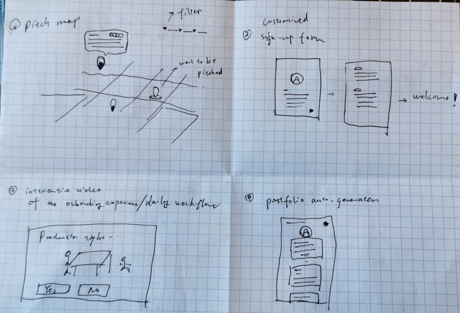
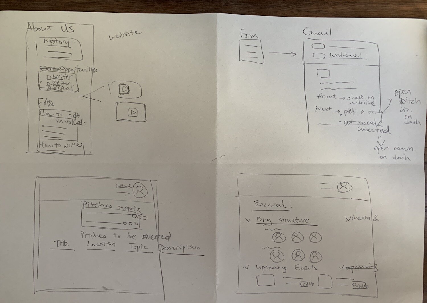
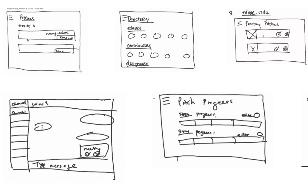
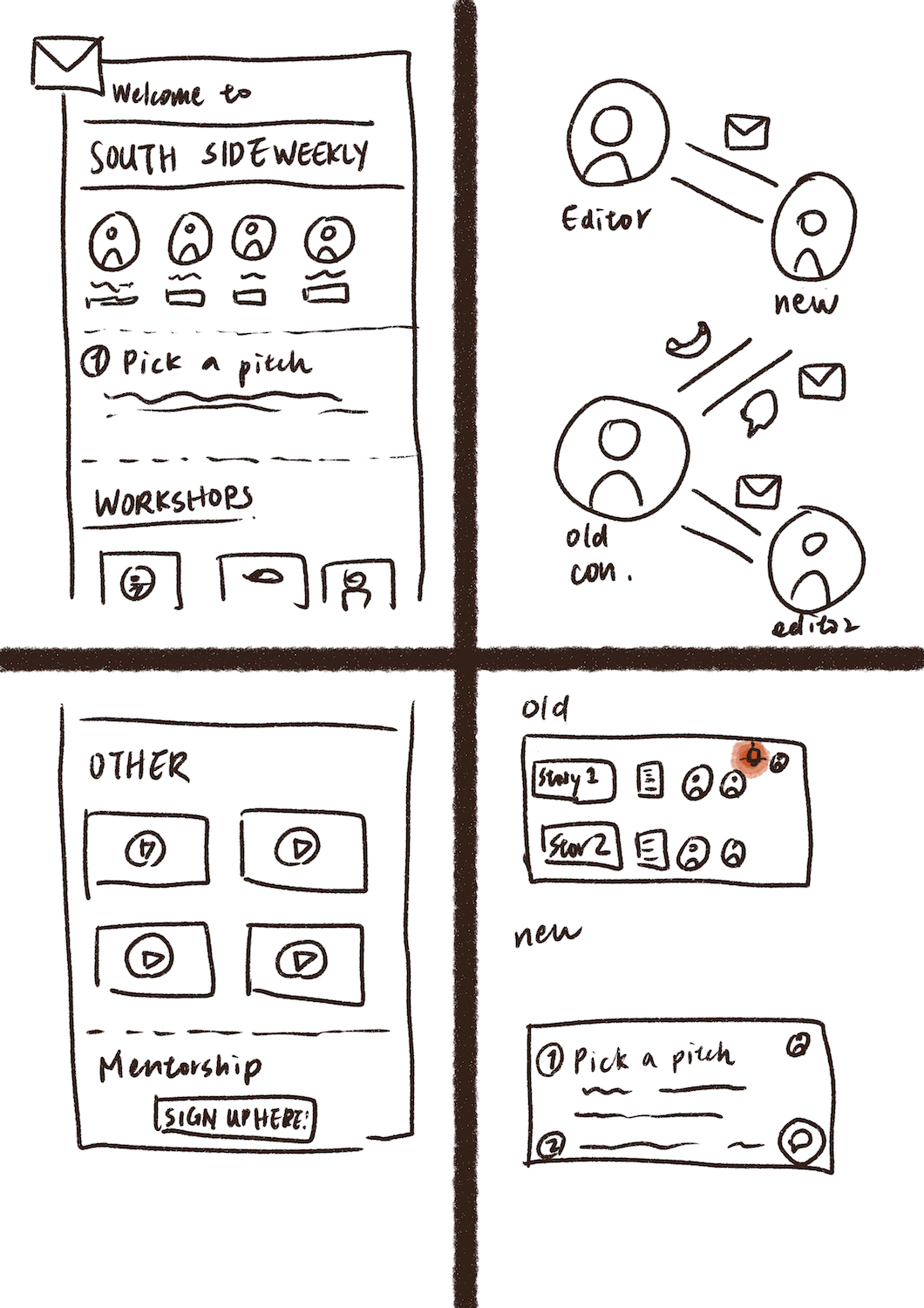
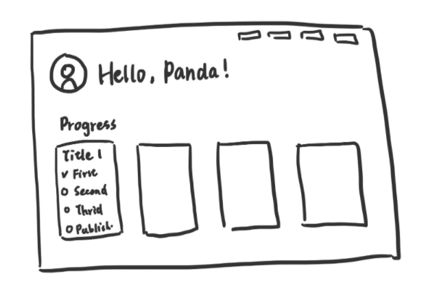
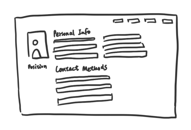
Brainstorm sketches
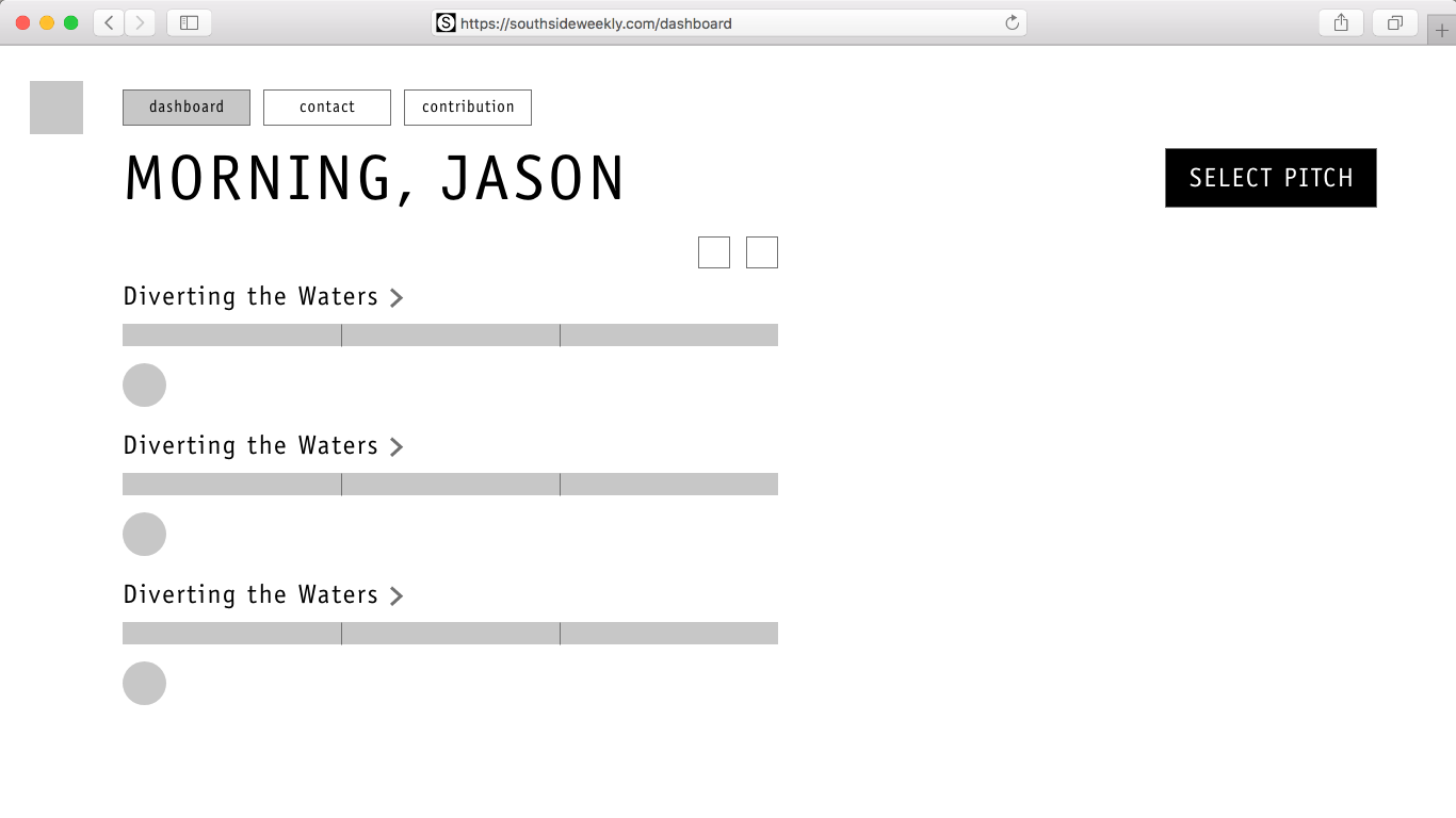
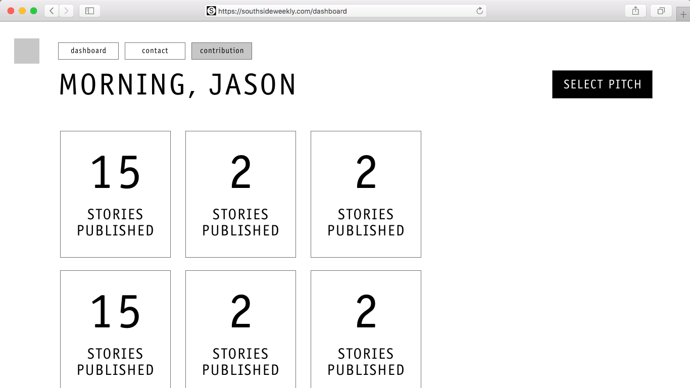
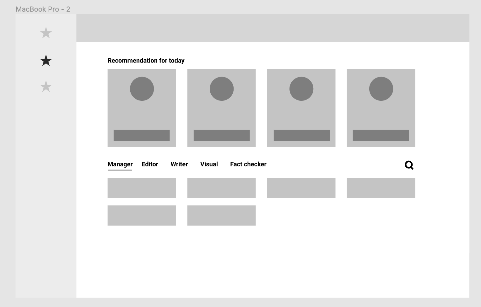
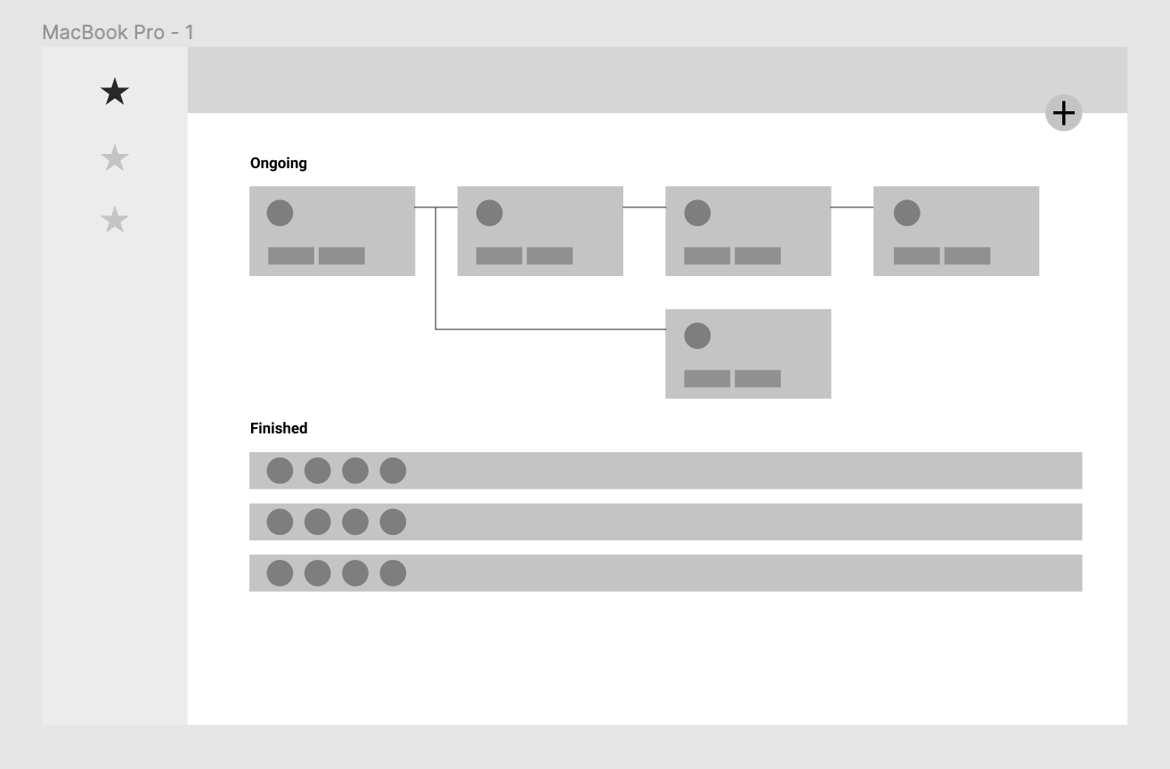
Wireframes
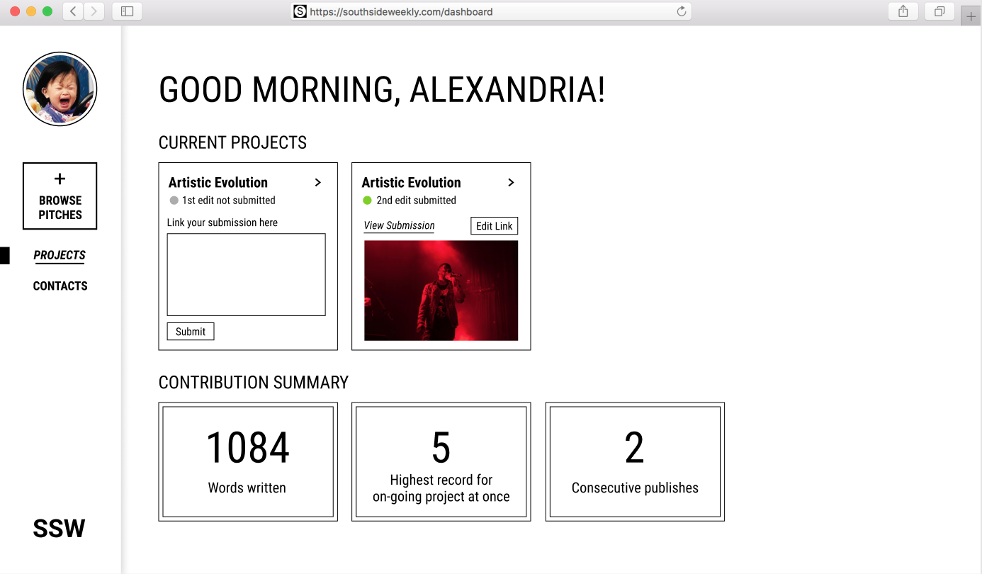
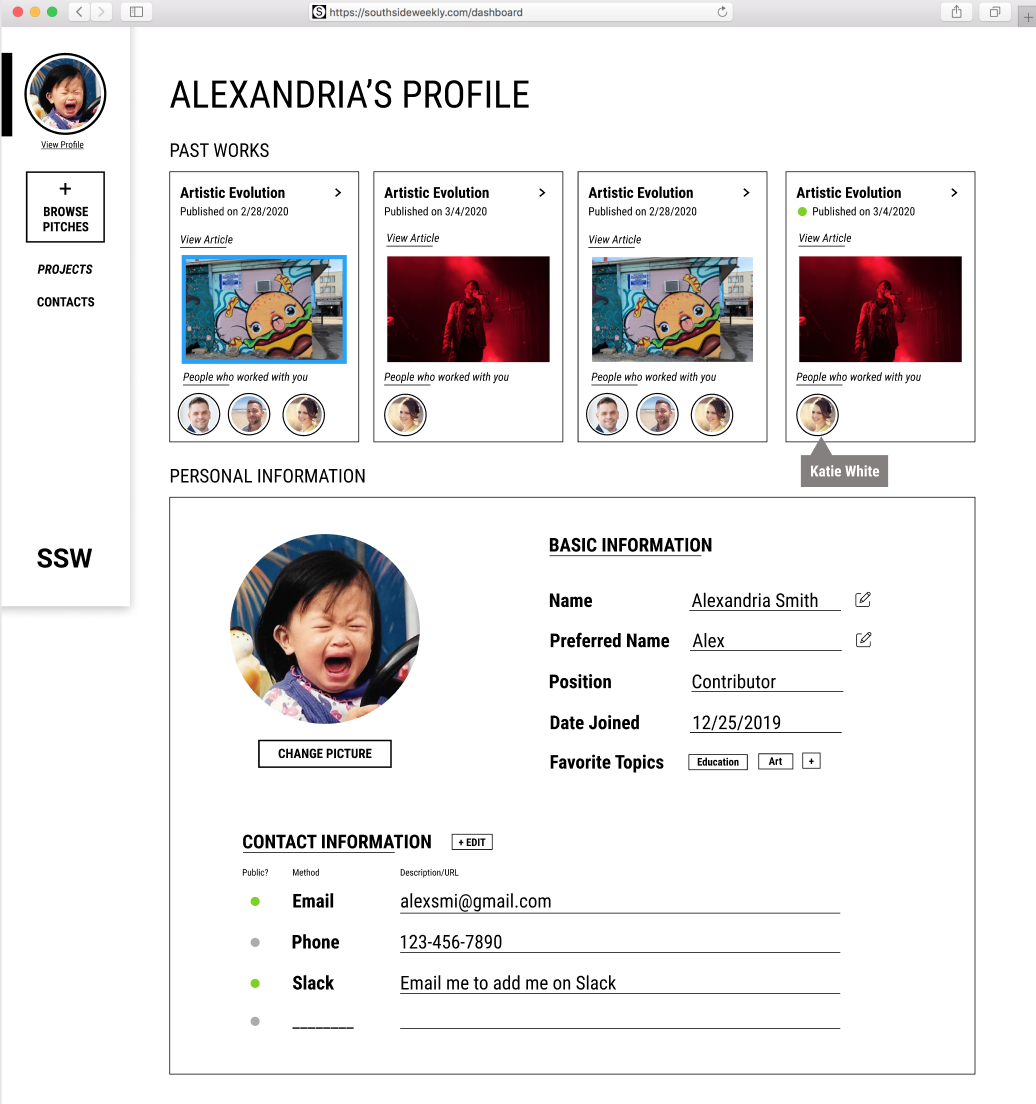
Prototype
Style inspired by SSW’s website
User testing
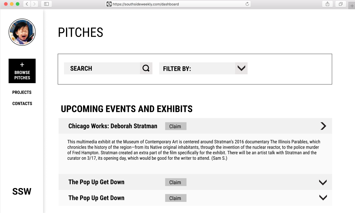
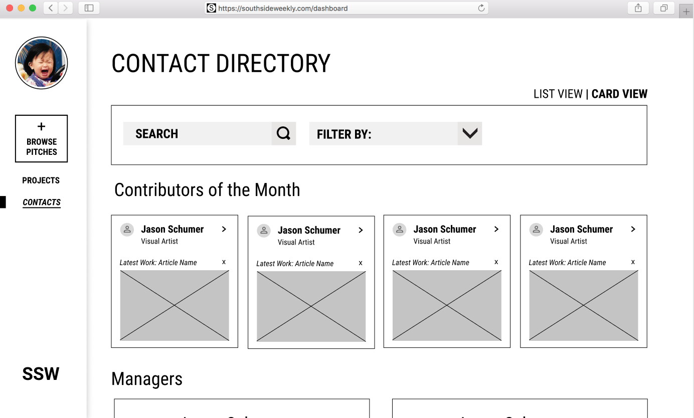
We asked 5 testers with volunteering experience to test out our prototype through Zoom screen sharing. They were tasked with 4 main tasks including describing what they see and feel about the landing page (“projects”), where they’d find a pitch to write for and how they interpret the word “pitches”, how they’d edit their communication preference and where they’d find a contact’s email. Some feedback is listed below:
Want to see summaries such as "number of likes, shares, reposts"
Not intuitive for current projects and past projects to be on different projects
“Browse pitches” and the + sign doesn’t match up cognitively
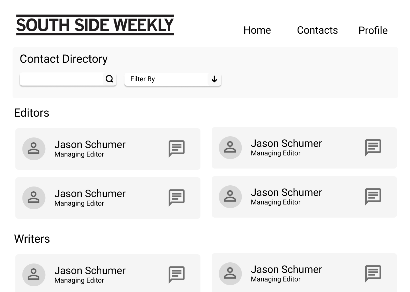
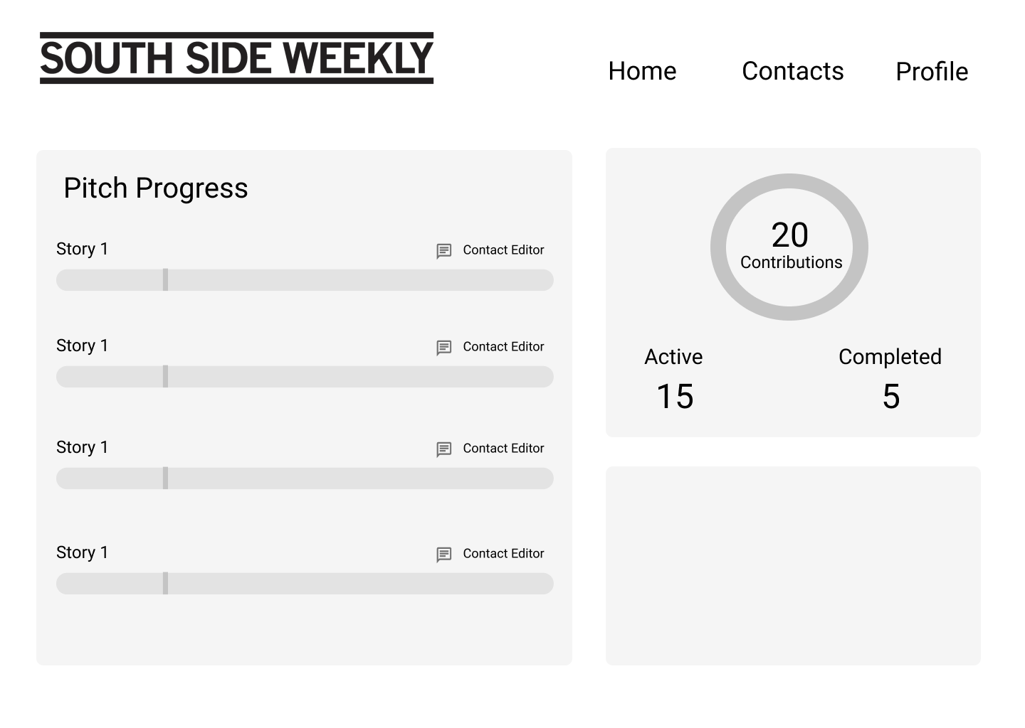
Final product
Suggestions
for findings that were out of scope
Create a more welcoming atmosphere in the office where onboarding happens
Refine information provided during onboarding to help newcomers understand first steps, workflow and expectations
Host office hours more frequently to help increase face to face interaction and answer questions
Rename “office hours” to a more friendly and inviting name
Host events to encourage interaction and bond between volunteers
Introduce a mentor/mentee program for more experienced volunteers to guide newcomers
〰️ the nerdy stuff 〰️
Duration: Jan 2020 - Apr 2020 (4 mo)
Tool: Figma
Skills & Keywords: interview protocol creation, interview, affinity map creation, web design, wireframing, prototyping, user testing
Exhibition: UMSI Student Exposition - Spring 2020
Collaborators: Sophie Niu, Botao Lu, Elena Fang, Jessica Chiu
